New Kid on the Block - Introducing Hooker’s Green to my Palette

Viridian and I are not friends.

Viridian and I are not friends.

Years ago when I started dabbling in watercolour I read a lot of sound instructional books by Alwyn Crawshaw. He recommended amongst others Hooker’s Green as part of a beginners’ starter set of paints.

I used it then but for over 15 years it has not been on my palette. I have no idea why I strayed away from this stalwart, reliable and sensible green!

So - I have re-introduced him to my palette at the cost of wiping the dreaded Viridian from my watercolour wells forever!

Viridian (also Pthalo and Winsor Green) and I are not friends.

Viridian unnerves me, I find it cold, chemical-looking and way too overpowering for my paintings. How it has lasted so long is only because it mixes brilliantly with Alizarin Crimson to give a bitchy and velvety “black”. It is soon to be leaving my palette. I am sure Hookers will team up with Alizarin and produce something equally as wonderful.

As for the other greens that I have been using for a while they are as follows:-

Permanent Sap Green - an easy mixer and gentle middle of the road grassy green - a happy chappy who makes me feel safe.

Olive Green - a serious and deep blackened green - to be used in moderation or it can make a painting look a bit sullen.

Cobalt Turquoise - a versatile and turquoisey green which mixes well with reds and pinks to give arty greys! I feel a bit risque whenever I use this colour.

Give us the low-down on your reds or blues or browns if you paint - I’d love to hear how you feel about them.

Midnight Storm

Having painted almost nothing but high-key for a long time I fancied a deep and moody plunge into darkness and drama.

Midnight Storm - pastel and watercolour 8x6 inches

Midnight Storm - pastel and watercolour 8×6 inches


I painted an imaginary snow scene high in the mountains from my head in watercolour wet onto wet without a drawing to just create some abstract shapes that pleased me.


The finished watercolour was too flat and one dimensional so I had to go back in there with soft pastel. Do you think I managed to rescue it or is it too confusing?


I am going to try and find a real scene similar to this to paint again with a better idea of the image than the vague one in my head.

Painting Cherries in Watercolour - step-by-step demo

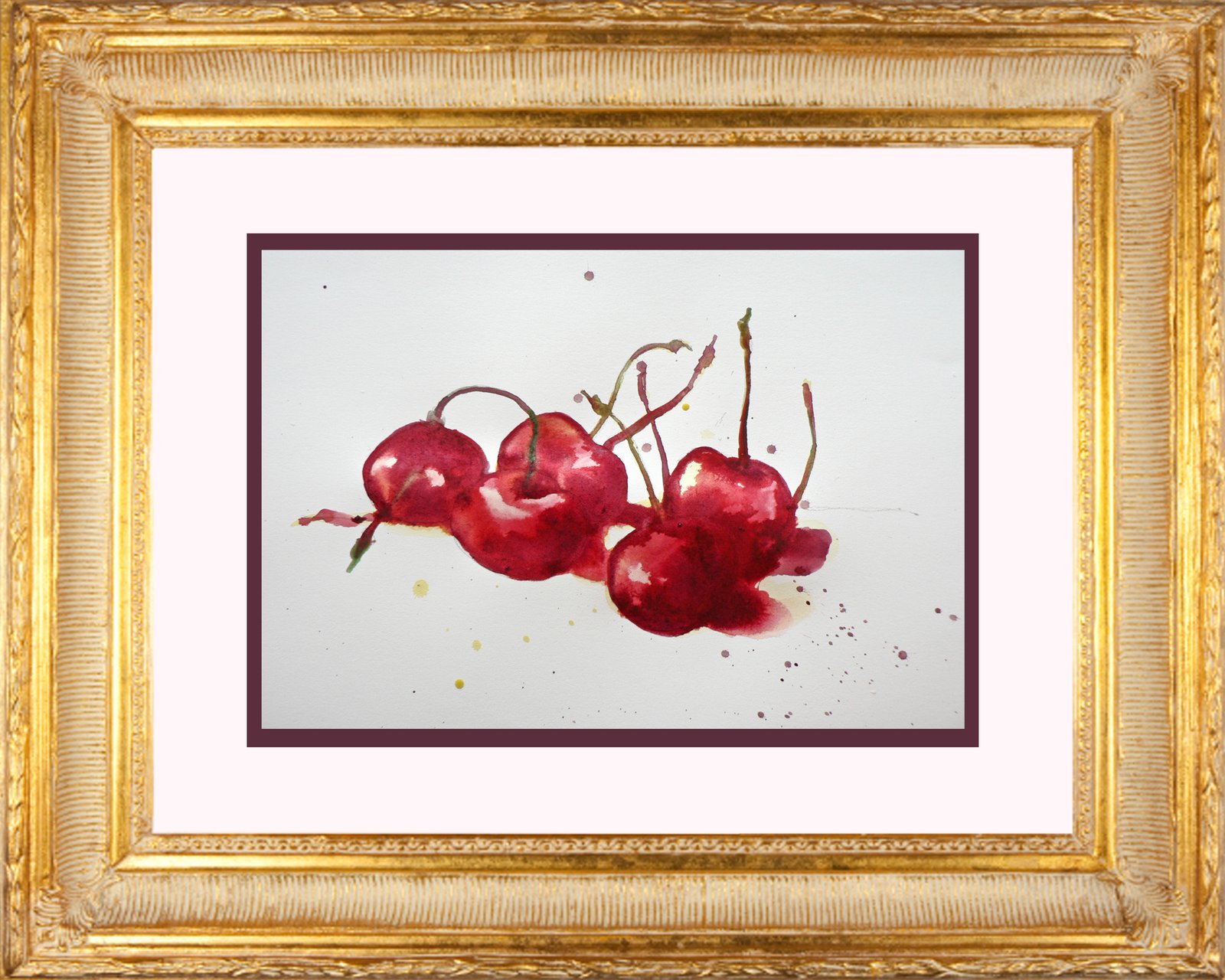
In a virtual  frame but not quite finished yet.....

In a virtual frame but not quite finished yet…..

Always a satisfying subject to paint cherries are. I love their beautiful red, claret colour and the spindly curvy stems. They make a beautiful composition no matter how you place them in readiness to paint.

Brushes at the ready but I only used a 3 and a 6 round really.

Brushes at the ready but I only used a 3 and a 6 round really.


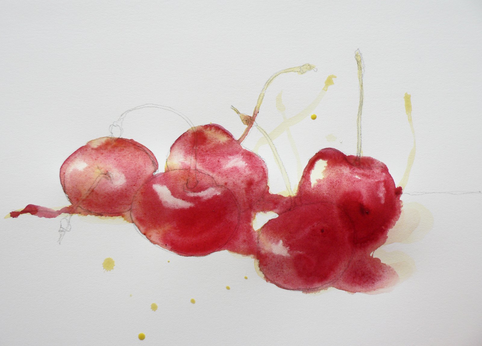
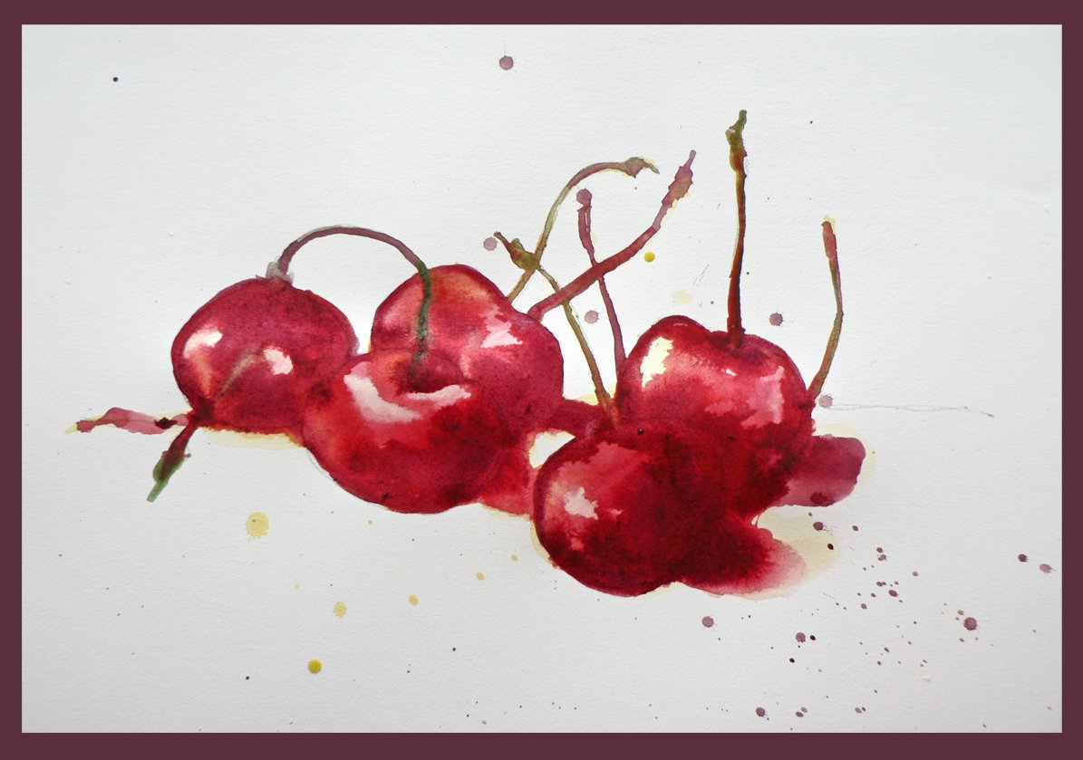
Here is a group of 5 cherries with stems. I just used Arches hot pressed 90lbs paper and a Size 6 and a szie 3 round brush plus Cadmium Yellow Pale, Alizarin Crimson, Rose Madder Genuine, Olive Green and French Ultramarine to paint this simple study.

cherries demo

It is not finished yet as I have work to do on the shadow sides and to create more shine on the sunstruck parts of the cherries…watch this space for the final final result:)

I lifted the white "shiners" out with a clean dampish brush.

I lifted the white “shiners” out with a clean dampish brush.


I was satisfied with this painting because it went well with the washes looking natural and the forms shaping up nicely. I relished in plunging the deep red/clarets into the wet washes to get the darkest part of the fruits shown.

cherries f